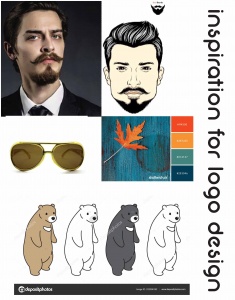
Your logo is you or your business’ first point of contact with the outside world. If people connect with your branding, the likelihood is they’ll be more open to whatever it is offering them. Your logo remains the centerpiece of your branding schemes and it’s often the part of your identity that is most critically picked apart by the public. It’s important to remember that when we look at something, we don’t read first. Before anything else we see shape, we see color, and if that’s enough to hold our attention, then we’ll read. So in every instance, regardless of company, the small but essential element in the brand picture is the logo.

A graphic designers task it to collect and distill the essence of a brand into the shape and colors that not only represent the brand but also create an image that is likely to stand the test of time. The Nike swoosh, McDonald’s golden arches, the Michelin man and the Mercedes’ three-pointed star are just a few of the more high-profile examples. One of the most interesting parts of being a designer is that you get to learn new things with each new customer. Every client is different, even in the same business there are nuances that separate competitors.

To make it easier to get agreement on your design proposals, you need really dig into the company and ask the right questions to gain the essence of the company. Why are you here? What do you do, and how do you do it? What makes you different? Who are you here for? What do you value the most? What makes you different? What are your biggest strengths? Those questions might seem quite straightforward, but they can be challenging to answer, and they’ll lead to further questions about your clients’ businesses.
What you discover in this phase of a project will help to determine the strongest possible design direction. It may even be appropriate to have a brainstorming session and have your hand sketch concepts and ideas during that session. One trick a designer can use is to develop the concept sketch in black and white. Leave the color until the end helps you focus your attention on the basics of the idea rather than something that’s much easier to change. A poor idea can’t be rescued by color. A good idea will be good regardless of color. Picture a well-known symbol. Think of it now. It’s the form we remember before the palette. It’s the lines, the shapes, the idea, whether that’s the bite from an apple, three parallel stripes, four linked circles in a horizontal line, or something else.

When it comes to color and shape there are copious psychological factors that come into play. When designing a logo graphic designers work with you to ensure that the color and design you select best represents your company to the public. For more on color and shape psychology check out our blog!

Simplicity aids recognition, especially when so many brands are competing for our attention. You want to give onlookers the opportunity to recall a mark after just a quick glance, and that’s not possible with an overly detailed design. A logo has to be focused in concept – have a single ‘story’ – and in most cases must be uncomplicated in form. This is because it needs to work at a variety of sizes and in a range of applications, from a website icon in a browser bar to signage on a building as well as your printed collateral.

When it comes to logo design, no one does it better than our design staff at Paramount signs.
If you are considering creating an new logo or looking to upgrade your logo to better match your company today, give us a call for a free consultation.
We believe that getting you noticed is PARAMOUNT!

